For four thousand two hundred and seventy nine reasons ...
approximately, I have been thinking about craft and what makes design
compelling. Some of you are going to
jump immediately to the conclusion that this is about art. Fine.
Have it your way. It can be about
art too, but for me it's really about transcending the banal. So I guess it doesn't really matter if you
believe Art is a window washer in Milwaukee, or so very important that there
should be no applause because it interrupts the concentration of the
ARTIST. Feel free to clap for me any
time the urge strikes. I truly need all
the applause I can get. Not that that's
ever happened. I mean, that would just
be weird. Yeah. I seem to have strayed from my
point....again.
Anyway, I believe there can be no art or compelling craft
without technique. So for the purposes
of this conversation, I am going to assume a certain degree of technical
mastery. ( I kill myself. "conversation". That's a good one. It's a monologue at best and probably will go
essentially unread.)
There is something that separates ordinary ideas from ideas
that make us see a thing in a new way. This is what I have been thinking
about. What is it besides elusive. How do I grasp it? Can I
define it for myself so that my work gets better? Unfortunately using the advantage of the
critic, I can see where others have missed opportunities to rise above the ordinary. It is, however, not so easy to critique my
own work especially as I am doing it. In case you were wondering, this is a gigantic
bummer.
There are designers that I admire. Phillip Stark has the
ability to manipulate the elements of design in a magical way. So in spite of the fact that he is so incredibly French, I really enjoy looking
at his designs. Not all of them though,
because clearly there is pressure to produce and inspiration can't always keep
up.
As usual I
am going to digress here. I could give
you multiple links to explain to various degrees the elements of design. There are some number of them. Ya know, ten, seven, six. I don't know. So I will give you my short explanation of
what I remember and then we can count how many I come up with.
LINE - that just seems straight forward
enough. Straight or squiggly, clean or
dirty. That sort of thing.
SHAPE -
again that doesn't seem to complicated.
Round or square, skinny or rotund.
COLOR - I
mostly use black, but sometimes white or yellow.
TEXTURE -
smooth or lumpy. I don't know. Hammer marks or no hammer marks.
SCALE -
size. This can create some good
comedy.
Those are the ones that come to mind for me. The Getty has this
which makes it all complicated and painful, but they are experts so maybe you
should look there.
Back to Phillip Stark.
When I first became aware of his work what struck me was how he manipulated line, shape and
scale to make an ordinary object visible in an altogether new way. I saw the objects for the first time and
experienced them as a child would.
| So this |
| Became this |
| And this |
| Became this |
Simple. No?
No.
If I haven't lost you
yet, and I suspect I have which means I can say anything I want here because I
am talking to myself. Like this ...
sometimes I don't wear underwear when I go to the gym.
Anyway, what I was
about to say is that this is not simple.
I have been watching Project Runway. Which is mostly goofy, but seeing the
designers struggle with the artificial
constraints of the show is enlightening. I can see how easily they
retreat to their comfort zone when stumped.
The judge's critiques are .... uh .... not really helpful from a design
perspective but perhaps useful for understanding how people see and react to
what they see. Yeah, I don't know what that means either. What I'm saying is "I don't like
it" is not a useful critique. I
think in order for a designer to grow they need to know why it didn't
work. Not just that it didn't. Also it's important to find a way to step beyond the comfort zone. This applies to everything. I don't like FOX News or MSNBC because they never stray from their comfort zones. I no longer care if they are right or wrong because they spend all their time telling me what I think rather than telling me what they think and making me think about their ideas in a new way. In case you were wondering, that wasn't really another digression. But I'm going to let you figure out why not.
So I guess what I am trying to say is, my challenge is to find a way not to retreat
to my comfort zone. I need to find a way
to bring out a childlike sense of wonder in others while still making things that function
properly.
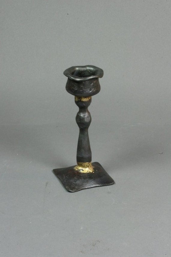
This is a recent attempt. If you have gotten this far, please tell me
what you think.
| A typical brass candlestick |
 |
| My candlestick |
See how I did that. I made mine big.
Now, back to work
j

No comments:
Post a Comment